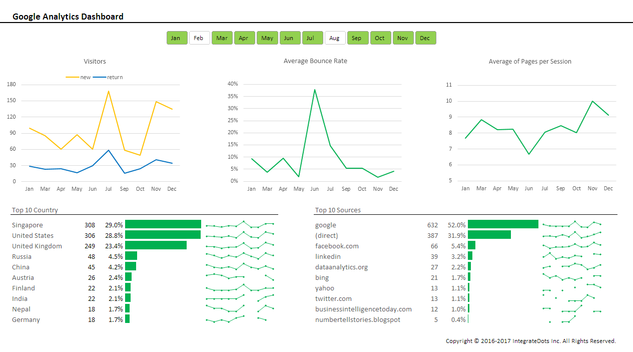
Joe is a data junkie who aspires to be a great Data Scientist one day. He blogs regularly on data analytics, mangling, visualization, … etc. With the help Google tracking codes embedded all over his blog posts and website, Joe is able to track the visitors to his website. He wonders how effective his website is serving the ever growing data community on the Net?
He would like to have an interactive Google Analytics Dashboard to provide at-a-glance view of the following desired KPIs over a 12-month period. Joe wants a Dashboard that allows him to slice and dice the data by month(s).
Here are desired Key Performance Indicators (KPIs):
- new vs return visitors by month
- average bounce rate by month
- average of pages per session by month
- top 10 country where the visitors came from by month
- top 10 traffic sources by month
Joe has decided to implement the Dashboard using Microsoft Excel. Here’s his completed Google Analytics Dashboard:-

The next public Dashboard talk and workshop at NUSS are on 23 March 2017 and 8 Apr 2017.
Besides these public talks and workshops, we also conduct talks and workshops in-house for clients. If you’d like to have any talks or workshops customized to suit your organizational needs, we’d love to hear from you! Contact us here.
