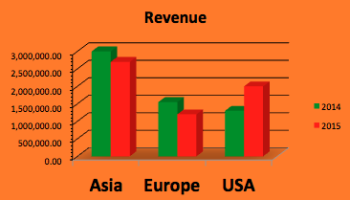
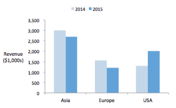
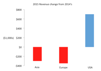
In this post, we’ll briefly discuss 3 key design considerations for a dashboard. There are other design considerations, of course, which we could discuss in another post.
1) Include only essential information
The real estate on a dashboard is precious. Display only essential information critical to business or operations on dashboard. Another reason is that the user cannot possibly process too much information at one glance.
On occasion where there is a need to drill down for details, put the additional information on a separate screen. Design the dashboard to be interactive (e.g. radio button) so that user can select the required screen.
2) Choose the correct graph types
Generally we can interpret length much quicker and more accurately than area. Therefore, as far as possible, bar graphs (either horizontal or vertical) is preferred to area graphs (e.g. pie chart). Another group of graphs to avoid is 3-D graphs. A key problem associated with 3-D graph is that certain information may be occluded in 3-D representation.
Opt to display information using small form factor graphs. Two excellent choices are the sparklines and bullet graphs. These graphs do not take up too much space but yet they pack a ton of information. Avoid fanciful gauges and pie charts. These take up too much space and convey less information.

3) Maximize Data-Ink ratio
The data-ink ratio is a term coined by Edward Tufte, a pioneer in field of effective data presentation. It is the proportion of ink (or pixels) that is used to present actual data compared to the total amount of ink (or pixels) used in the entire display.
“A large share of ink on a graphic should present data-information, the ink changing as the data change. Data-ink is the non-erasable core of a graphic, the non-redundant ink arranged in response to variation in the numbers represented.” – Edward Tufte
Data-ink is the non-erasable ink (or pixels) used for the presentation of data. Removing data-ink from a graph would result in a loss of information. On the other hand, non data-ink should be removed so the essential information could stand out. A well-designed dashboard aims to maximize the data-ink ratio.


We’d be discussing a Dashboard example in a later post.
